Monday, March 26, 2012

Visual communication.

This is a Prt Scr of the artist David Carson. The two images on this web page gave me an idea for my work.
I did a questionare to find out what people would like in the advert and one of the questions asked What they would think would make an advert good? ... People did say colourful. But the majority said for it to be bold and to the point. Which is why I let this piece of Art work inspire me. Because the first piece on the top is bold and artistic and it is typography which is the style that we have chosen to do our advert in.


This is the video that I first watched that inspired the idea to make our advert a kinetic typography one.
After I had watched it I started to look at many other Kinetic typography videos so that I can get a good idea of the quality thay are at and the styles they are in. I did experiment with videos to add the odd colour into them like this video did. But it did not fit with the bold Black & White Connor and I had planned.

This is the video that the above image where taken from.


This is the other video that strongly inspired me. Because this video had images in it. I really wanted to have image to make in our kinetic typography for our advert. But I chose not to because images take quite a while to make.

Tuesday, February 7, 2012

Advert ideas.

The ideas that Connor and I have come up with so far:

The first idea was to do it all in stop motion. There is a story board but I haven't photographed it yet. And it was to do a stop motion of drawings of this room. firstly there will be a shot of this room empty and then the tables and chairs also drawn will fall into the room. Then there will be a zoom up the back board at the back of the room. Then there will be kinetic typography in the style of chalk saying " Interactive media and games Art".

The second idea that we came up with was an idea of maybe an image of of Martial pointing in the image as a copy of the WWI/II poster saying " WE NEED YOU!".

The third idea that we came up with was a picture of the college and to have it melting into games remotes.

I like all of these ideas really but must talk to my working partner to discuss what would be more appropriate and simple to do.

The final idea that we have come up with now is to  have an image of the college somewhat looking like it is made out of card board. Or maybe actually made out of card. I think in the process of it folding and such The shelf base thing that it is folding to. Could be sloly rotating. I'm not This is the final video after we went through the ideas. We decided to do typography after all.

Monday, January 30, 2012

Artist research.


I'm not too sure of the artists name who made these motion graphics compilations. But there was a website and a facebook page to go with the videos that he has produced.

I like a lot of the videos that this company produced because they also explain a lot about how they produced it, which member of their company 


This is the design of the companies homepage. Set out in a simplistic way so people can easily browse through the videos posted by the artist or artists.


This is the video that I found originally that led me to this guys website and pages.


This was the first video of this artist/ company.  I like this piece because it demonstrates all the different


"I do lots of things, video and photo editing, motion graphics, illustrations, sound design, camera, directing, etc... the whole bunch."


The second website I am researching is http://www.k-motion.tv.

It seems from what I have found out is that this company works with making adverts for the television.
I like the work that they produce, it fits the meaning of what they are trying to depict. And it is very creative. I also like the videos they produce.


I like this video because it is pretty much what it says on the package.
It is examples of what you can do with the advertising. I can say that this video by far explains more than the web site itself does.
The web site portraying this video is very plain and dull.
I think that maybe the video being on the home page of this web site should have been matching the the colour sceme as there is a blue web site...  Then a random video and a random red bus planted n it. I think that it makes this web site look a little messy.
I like the video though because it has presented this web site in a more creative manner and with-in the video title is also self explanitory.
It also explains else where in the same web site on a different video that people could if they wanted to, advertise on paper. But if they wanted come to Blue Lollipop Media and have them advertise for you.


Questionnaire
How would you like a course to be presented?
I.e.  Video, Prospectus, Web advertisement... 
Video
DVD
Funny Video
Bouncy castles 

What do you like in an advert to draw you to it?
 Funny images/Cartoon
Music
Bright colours/Sends a message
Useful Product

 Would you like to see some examples of other students work that were previously on this course?
 no
yes
yes
no
yes
What do you think about advertisement?
 cool
alright
annoying
There's too much of them
Do you like Games?
 Yes
yes
yes
yes
Who doesn't
What interests you about games?
Yes
RP
RP
RP
RTS
What would you like to see in an advert about any course?
Catchy
Colourful
How do you feel that seeing examples of work would benefit you?
Avoid confusion
useful 
Have you ever researched more into something you have seen in an advert?
I.e. A product, a course or a Direct line?
yes 
no
no
Have you ever seen an advert during travel? 
yes
If so.. What are the general types of advertisement you see?
bill boards, shop windows, easteraggs planted in streets. E.g..small stickers. 


LAMBORGHINI PACEMAKER from Sehsucht™ on Vimeo.


 I like this video because of the style of the graphics. It looks to be very reel. It is very surreal.
They have used the graphic to tell a story of what they portray as a major componant to the product they are advertising, then they show parts of the car to get the audience watching until at the end the unveiling of the lamborghini.
I like the style of the graphics because it is very dark and some sense very explanitory in what it is trying to represent which is somewhat the creation of the car that it is trying to advertise. This one stood out more than all of the rest that I have researched because it is very complex, bold and takes a while to get a hold of people.


I know part of the research was to annotate adverts using graphics. But I am annotating this video instead as it is relevent to the type of graphics that I will be using for mine and Connor's college advert. Which is Typography. 
I chose this video because I like the effort put into this video, it uses a good range of colour relevent to the song playing.

Monday, January 9, 2012

Monday.

Adobe After effects tutorial.
09/01/2012.

File>import>file.
Libraries>Videos.


Composition> New Composition.


Press OK.


Select a small selection of the video as


you will be using this shortly.


Press the RAM preview button to render the video.


Right click on the selection made. And select the bottom selection.


09/01/2012

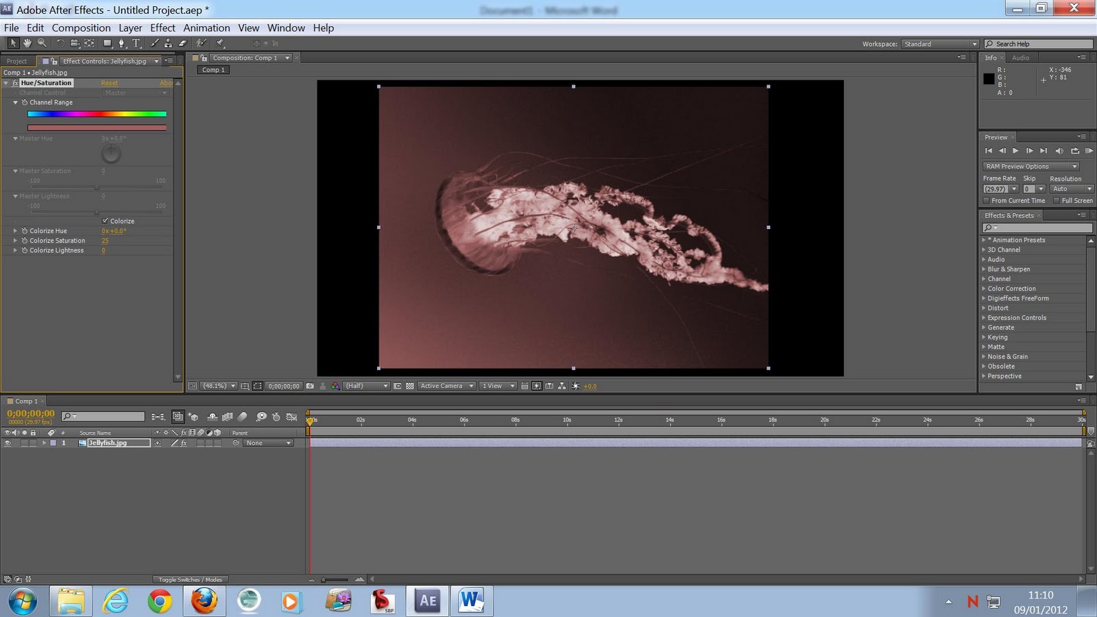
Second Adobe After Effects.
Hue/Saturation.


This time we used an image instead of a video file.


Effects> Colour correction.


Effects>Colour Correction> Hue/Saturation.

Can now see the effects that you can use at the left side of the video.

Click colourise.

Click on the little timer next to colourise Hue.

Every five (or whatever preference) seconds click on the time line and drag the slider next to colourise hue till the image is a different colour.


I also messed with the saturation to give the image some more colour.


This is the finished video.


09/01/2012
Third Adobe After Effects tutorial.
Opacity/ Scale/ Rotation.


In this tutorial we learned to change the rotation and opacity and scale of an image.


This is the opacity change through out the time line.. We made a point that at 0s the opacity was at 0%. Then at 10s change the opacity to 100%. Then make a point at 2s and a point at 8s. Click at 10s and change the opacity back to 0%.


The same is done with the scale of the image.


We did the same to the text while also adding the rotation which is also the same process.

This is the final outcome of this tutorial.


16/01/2012
Text/ Lens flare/ effects.


Make a new composition and a layer> solid. Make sure that the colour is Black.


To add flare. Go to effects, Generate, Lens flare.
Here is the lens flare effect.
Layer>new> Text.
Type a random word or a name.
Click the selection tool to make the text bigger and to move the text.
This is the text larger. Now move the text to the center.
Like so.
Select the rectangle tool or press Q.
This will create a mask.  Select the mode on the mask layer and select "subtract".
The text will disappear.

The text in these images are shown though to make it easier to pin point where to position the flare.
Click the stop watch icons next to "Flare center" and "Flare brightness". Throughout the time-line position the center and mess with the brightness. 
Position the layer mask to follow the flare.
Example.
Example.
Click mode in the text layer and select "stencil alpha".

Final results..


23/01/2012

Today we used puppet warp to create anchor points in an image to move the joints of image around.


I also made a second one after fiddling with the original video that I made.


The source of this image was from Google. I searched for an image of Mr. Blobby the childrens TV character when I was small. It led me to an image of a costume on a website found here.
The stamp at the bottom of the website read "Truffle Shuffle 80s Clothing Limited". And I assume that is the name of the company. this is the distributing website where this product can be found. http://www.truffleshuffle.co.uk.


Today I used all of the tutorials that I have had and used what I have learned to produce this video.


I changed the text font of this video and edited it to look what I think is better.


30/01/2012


Today we learned about making Paper cut outs.
This is what I made from the tutorial. 


06/02/2012

Today we created a 3D picture montage.


Import images/movies into a folder named images.
New composition but name it "Main". Presets. HDV/HDTV
Make another New composition but name it "image box 1", Presets Square pixels.
drag image to the image box 1 comp.
Make image 3D.


Here is a video that I had made on After effects using the things that we where taught in our tutorials and using my initiative to navigate through after effects.


This is the video that we had created using the photos we got on our trip into town.
We took photographs of signs roads people shops and just random ones of areas and put them together and edited them to create this video for our project.
We used the the fish in the image from the the photo of the pathement that we walked on out side of the aquarium. The fish where used as a path in the video to incorporate the aquarium as the theme also since that was what the video was about.


For the beggining of our project video I had the name of the college and the name of the course.
I experimented lots with these videos by creating three for me and Connor to agree on.

This is another that I'd made in Adobe after effects.


I didn't really think that I really had to make three videos. But I did anyway because I kept making samples for a wider range of experiments to choose from.
Though I did not feel that there was a point in making a third. This was the one that got chosen because as I progressed in making them they kept getting better and better.