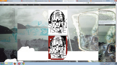
This is a Prt Scr of the artist David Carson. The two images on this web page gave me an idea for my work.
I did a questionare to find out what people would like in the advert and one of the questions asked What they would think would make an advert good? ... People did say colourful. But the majority said for it to be bold and to the point. Which is why I let this piece of Art work inspire me. Because the first piece on the top is bold and artistic and it is typography which is the style that we have chosen to do our advert in.
I did a questionare to find out what people would like in the advert and one of the questions asked What they would think would make an advert good? ... People did say colourful. But the majority said for it to be bold and to the point. Which is why I let this piece of Art work inspire me. Because the first piece on the top is bold and artistic and it is typography which is the style that we have chosen to do our advert in.
This is the video that I first watched that inspired the idea to make our advert a kinetic typography one.
After I had watched it I started to look at many other Kinetic typography videos so that I can get a good idea of the quality thay are at and the styles they are in. I did experiment with videos to add the odd colour into them like this video did. But it did not fit with the bold Black & White Connor and I had planned.
This is the video that the above image where taken from.
This is the other video that strongly inspired me. Because this video had images in it. I really wanted to have image to make in our kinetic typography for our advert. But I chose not to because images take quite a while to make.

